


React E-Commerce App for Digital Products: Part 4 (Creating the Home Page)


TL;DR: Want to design a user-friendly e-commerce app for digital products with React? This guide unlocks the secrets to building a beautiful and functional Home Page, including showcasing products and adding to cart features. Dive in to learn more!
Welcome to the fourth blog of the series, “Designing a React E-Commerce App for Digital Products”. In the [first part](syncfusion.com/blogs/post/react-digital-eco.. "Blog: Designing a React E-Commerce App for Digital Products—Part 1"), we created an architectural diagram to create the user navigation and wireframes. We also set up the boilerplate, complete with public and private routes.
In the [second part](syncfusion.com/blogs/post/react-ecommerce-a.. "Blog: Designing a React E-Commerce App for Digital Products—Part 2 (Handling Authentication and Authorization)"), we implemented the web app’s authentication and authorization. This involved the creation of signup and login pages and their integration with a database for data persistence and session maintenance.
In the [third part](syncfusion.com/blogs/post/react-ecommerce-a.. "Blog: React E-Commerce App for Digital Products: Part 3 (Create Product Management Dashboard)") of the series, we created a dashboard where users can manage their products, from adding and updating to previewing them before publication.
Now, in part 4, we’re creating the home page. This component will showcase all available products, allowing users to browse, add items to their cart, and proceed to checkout. Our goal is to ensure that all products, whether created by the users or officially published, are prominently displayed on the home page. Additionally, we’ll develop separate components for the cart and checkout pages. The cart page will allow users to review selected items, while the checkout page will facilitate secure purchases.
To enhance accessibility, we’ll update our routing configuration. The product listing page and cart page will be public routes, accessible to all users. However, the checkout page will be a private route, requiring user authentication.
Refer to the following code example to set up the routing configuration for the application, directing users to different pages based on their authentication status in the App.js file.
import { BrowserRouter, Routes, Route } from "react-router-dom"; import Login from "./pages/login"; import Signup from "./pages/signup"; import PrivateRoutes from "./routes/private"; import PublicRoutes from "./routes/public"; import Dashboard from "./pages/dashboard"; import ManageProduct from "./pages/manageProduct"; import NotFound from "./pages/404"; import ProductPreview from "./pages/productPreview"; import Browse from "./pages/browse"; import Cart from "./pages/cart"; import Checkout from "./pages/checkout"; import ThankYou from "./pages/thankYou";
const App = () => { return ( }> } /> Product List}> }> }> }> }> }> }> }> } /> } /> } /> ); };
export default App;
[

Syncfusion React UI components are the developers’ choice to build user-friendly web applications. You deserve them too.
Explore Now
](syncfusion.com/react-components)
Designing the Home Page
When designing the home page in the browse.js file, we will utilize the DataGrid component again to display a list of products available for browsing.
browse.js
import "./productList.css"; import { Link } from "react-router-dom"; import useProducts from "../hooks/useProducts"; import productStore from "../store/products"; import cartStore from "../store/cart"; import DataGrid from "../components/DataGrid"; import Wrapper from "./browseWrapper";
const Browse = () => { useProducts(); const productsList = productStore((state) => state.productsList); const setCartItems = cartStore((state) => state.setCartItems);
const addProductToCart = (product) => { setCartItems({ [product.id]: product }); };
const ActionsTemplate = (e) => { return ( addProductToCart(e)} className="edit-product"> Add to cart / Preview ); };
return (
export default Browse;
The product list fetches all available products, so we’ll create a separate hook for this purpose named useProducts.js. Upon component mounting, this hook will store the fetched data in a [Zustand](learnersbucket.com/tutorials/react/micro-st.. "Micro-State management with Zustand in React") store to cache it on the client.
Refer to the following code example.
useProducts.js
import { useState, useEffect } from "react"; import useSupbase from "./supbase"; import productStore from "../store/products";
const useProducts = () => { const setProductsList = productStore((state) => state.setProductsList);
const supabase = useSupbase();
const fetchProducts = async () => { const { data: productData, error: productError } = await supabase .from("products") .select();
setProductsList(productData); try { } catch (e) { console.error("Error while fetching products list"); } };
useEffect(() => { fetchProducts(); }, []); };
export default useProducts;
The product items will have an Add to cart button to facilitate adding items to the cart. This cart is managed on the client side in the Zustand and stores the added items for each specific user.
store/cart.js
import { create } from "zustand"; import { persist } from "zustand/middleware";
let store = (set) => ({ items: {}, setCartItems: (item) => set((state) => ({ items: { ...state.items, ...item } })), updateCartItems: (items) => set(() => ({ items })), resetCart: () => set(() => ({ items: {} })), });
//persist the state with key "randomKey" store = persist(store, { name: "user-cart" });
//create the store let useStore = create(store);
export default useStore;
These stored cart items will be displayed on the cart page, while the number of items in the cart will be visible in the header. Therefore, we need to create a wrapper around the home page and cart page with a header that will show the number of items in the cart.
browserWrapper.js
import "@syncfusion/ej2-layouts/styles/material.css"; import "@syncfusion/ej2-react-buttons/styles/material.css"; import "@syncfusion/ej2-base/styles/material.css"; import "@syncfusion/ej2-react-navigations/styles/material.css"; import "./wrapper.css"; import { Link, NavLink } from "react-router-dom"; import useStore from "../store/user"; import cartStore from "../store/cart";
const Wrapper = ({ children }) => { const { isLoggedIn, firstName } = useStore((state) => state); const items = cartStore((state) => state.items); return (
(isActive ? "active" : "")} > Cart ({Object.keys(items).length})
export default Wrapper;
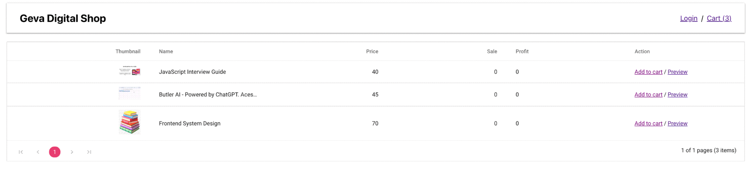
Home page in the React e-commerce app
Clicking the cart button in the header will take us to the cart page.
[

A to Z about Syncfusion’s versatile React components and their feature set.
Read Now
](ej2.syncfusion.com/react/documentation)
Designing the Cart Page
The cart page utilizes the DataGrid component to display products added to the cart by accessing them from the cart store (Zustand).
cart.jsx
import "./productList.css"; import cartStore from "../store/cart"; import useStore from "../store/user"; import Wrapper from "./browseWrapper"; import DataGrid from "../components/DataGrid"; import { Link } from "react-router-dom"; import "./cart.css";
const Cart = () => { const isLoggedIn = useStore((state) => state.isLoggedIn); const { items, updateCartItems } = cartStore((state) => state);
const removeCartItems = (product_id) => { const itemsClone = { ...items }; delete itemsClone[product_id]; updateCartItems(itemsClone); };
const ActionsTemplate = (e) => { return ( removeCartItems(e.id)} className="edit-product"> Remove ); };
const cartItems = Object.keys(items).map((e) => items[e]);
return (
export default Cart;
cart.css
.purchase-area { text-align: center; padding: 20px; margin: 20px; }
.purchase-area a { text-align: center; padding: 20px; display: inline-block; text-decoration: none; font-size: 1.2em; color: #fff; background: #4caf50; border-bottom: 1px solid #f7f7f7; transition: all 0.2s ease; }
.purchase-area a:hover { color: #000; }
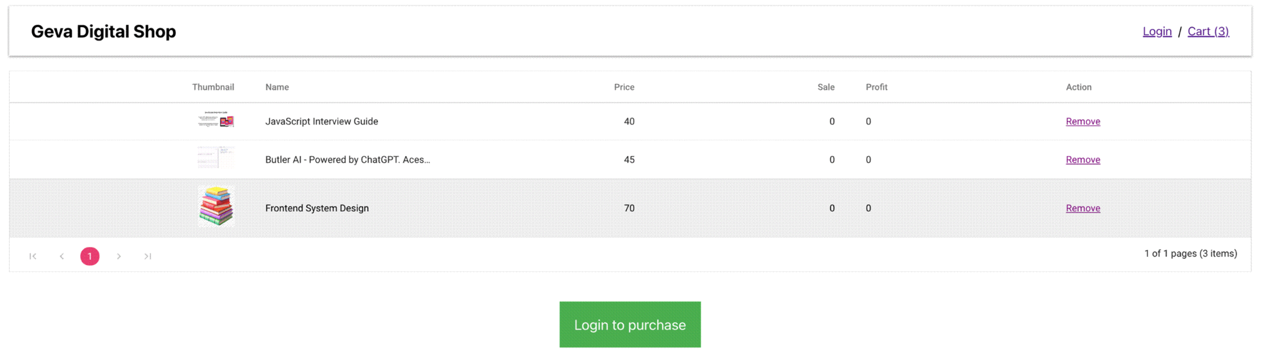
Cart-before-login page in the React e-commerce app
On the cart page, we check if the user is logged in or not. If they are not logged in, we prompt them to log in by displaying a Login to purchase button. On clicking this button, they will be redirected to the login page.
After logging in, they will be redirected to the dashboard page, where they can still see the cart in the header. Clicking on the cart in the header will navigate them to the checkout page.
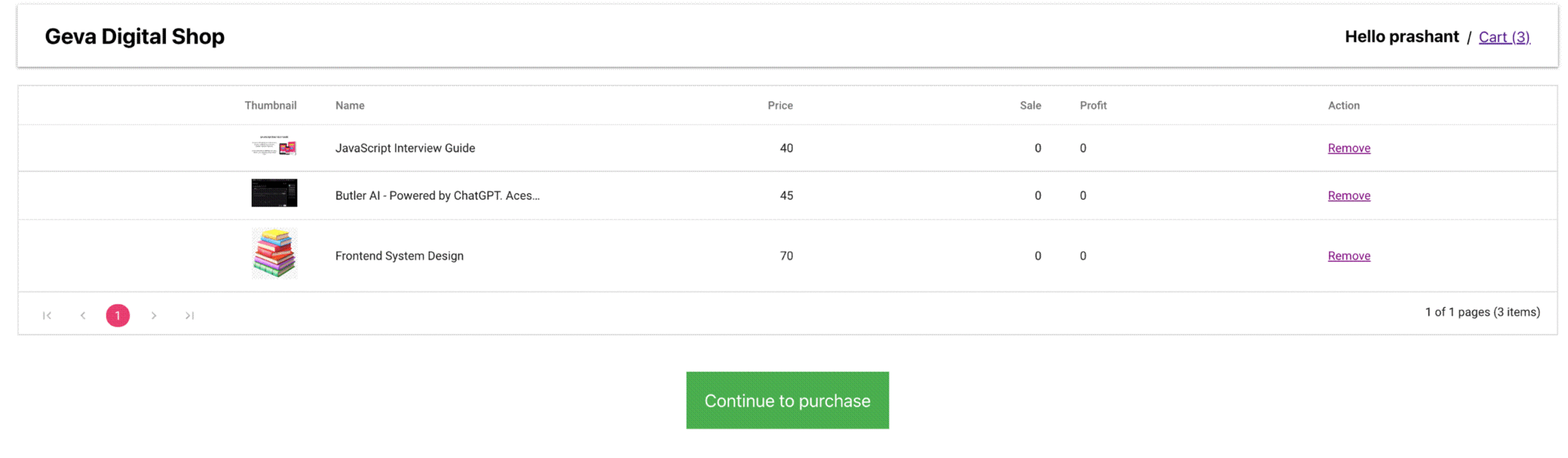
Cart-after-login page in the React e-commerce app
[

See the possibilities for yourself with live demos of Syncfusion React components.
Try Now
](ej2.syncfusion.com/home/react.html)
Designing the Checkout Page
The checkout page is one of the most crucial parts of any e-commerce site, as it is where users are most likely to abandon their carts if there are too many fields to fill out.
Thus, we aim to keep it simple by using two layout designs. On the right side, we show the cart items and the total cart value. On the left side, we display a form for users to fill out to complete the purchase.
checkout.jsx
const getCartTotal = (items) => { const itemsMapped = Object.keys(items).map((e) => items[e]);
const cartTotal = itemsMapped.reduce((a, b) => { const { product_price } = b; return a + Number(product_price); }, 0);
return cartTotal; };
const CartDetails = () => { const items = cartStore((state) => state.items);
const itemsMapped = Object.keys(items).map((e) => items[e]);
const cartTotal = getCartTotal(items);
const productsMapped = itemsMapped.map((e) => );
return (
const Products = ({ item }) => { return (
Syncfusion offers a set of input fields that are ready to use. Follow this guide on [creating a form with validation](ej2.syncfusion.com/react/documentation/form.. "Getting started with creating a form with validation").
We are creating a shipping form to gather the user’s shipping details. This form includes fields for the user’s:
- Full Name
- Phone Number
- Address
- Postal Code
- State
- Country
Each field undergoes validation and is marked as required. If a user tries to submit the form without filling in these fields, validation errors will appear.
checkout.jsx
const ShippingForm = () => { const navigate = useNavigate(); const { items, resetCart } = cartStore((state) => state); const supabase = useSupbase(); const userNameRef = useRef(null);
const formObject = useRef(null);
const initialState = { name: "", state: "", country: "", address: "", postal_code: "", phone_number: "", };
const reducer = (state, action) => { switch (action.type) { case "update": return { ...state, [action.field]: action.value }; default: return initialState; } };
const [state, dispatch] = useReducer(reducer, initialState);
const update = (field) => (event) => { //update action is dispatched to update the email and password state value. dispatch({ type: "update", field, value: event.value }); };
// checks the length of mask value and returns corresponding Boolean value. const customFn = (args) => { const argsLength = args.element.ej2_instances[0].value.length; return argsLength >= 10; };
useEffect(() => { userNameRef.current.focusIn(); const options = { // validation rules rules: { name: { required: [true, "* Please enter your full name"], }, phone_number: { numberValue: [customFn, "* Please enter your phone number"], }, address: { required: [true, "* Please enter your address"], }, postal_code: { required: [true, "* Please enter your postal code"], }, state: { required: [true, "* Please enter your state"], }, country: { required: [true, "* Please enter your country"], }, }, }; // Initialize the form validator formObject.current = new FormValidator("#form1", options); }, []);
const onSubmit = async (e) => { e.preventDefault();
try { const { data, error: userError } = await supabase.auth.getSession(); const { session } = data;
const address = JSON.stringify(state); const products = JSON.stringify(items); const total = getCartTotal(items); const { data: orderData, error: orderError } = await supabase .from("order") .insert({ total, address, products, user_id: session?.user?.id, }) .select();
if (!orderError) { formObject.current.element.reset(); resetCart(); navigate("/thank-you", { state: { orderId: orderData[0].id } }); } } catch (e) { console.error("Something went wrong", e); } };
return ( <>
Fill in your shipping details
Putting both together in the Checkout component allows for a cohesive display of the shipping form and cart details.
const Checkout = () => { return (
export default Checkout;
checkout.css
.checkout-wrapper { max-width: 800px; margin: 100px auto 0 auto; display: flex; }
.checkout-wrapper > main { padding: 40px; }
.checkout-wrapper > aside { width: 300px; margin-left: 15px; padding: 5px; }
.checkout-wrapper .form-group { margin: 10px; }
.checkout-wrapper .product-wrapper { text-align: center; }
.checkout-wrapper img { width: 100px; }
.checkout-wrapper .product { font-size: 14px; line-height: 1.3em; margin: 20px 0; border-bottom: 1px solid; }
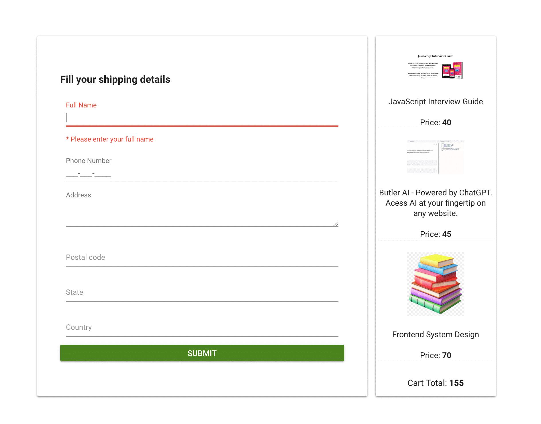
Checkout page in the React e-commerce app
Clicking the SUBMIT button adds an entry into the database and clears the local cart store. We’ve created a new table order in Supabase for this purpose.
create table public.order ( id bigint generated by default as identity, created_at timestamp with time zone not null default now(), total integer null, products json null, address json null, user_id character varying null, constraint order_pkey primary key (id) ) tablespace pg_default;
Then, insert the record into it by clicking the button.
const onSubmit = async (e) => { e.preventDefault();
try { const { data, error: userError } = await supabase.auth.getSession(); const { session } = data;
const address = JSON.stringify(state); const products = JSON.stringify(items); const total = getCartTotal(items); const { data: orderData, error: orderError } = await supabase .from("order") .insert({ total, address, products, user_id: session?.user?.id, }) .select();
if (!orderError) { formObject.current.element.reset(); resetCart(); navigate("/thank-you", { state: { orderId: orderData[0].id } }); } } catch (e) { console.error("Something went wrong", e); } };
After successfully adding the record, we navigate to the Thank you page with the order ID.
[

Explore the endless possibilities with Syncfusion’s outstanding React UI components.
Try It Free
](syncfusion.com/downloads/react)
Designing the Thank You Page
On the thank you page, we display the order ID of the purchase. If a user tries to access the thank you page directly without making a purchase, they are redirected to the dashboard page.
import { useLocation, useNavigate } from "react-router-dom";
const ThankYou = () => { const navigate = useNavigate(); const { state } = useLocation();
if (!state) { navigate("/dashboard"); return; }
const { orderId } = state;
return (
Thank you for your purchase
Your order id: {orderId}export default ThankYou;
Refer to the following image.
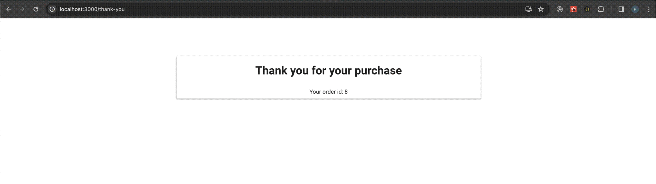
Thank you page in the React e-commerce app
Conclusion
We appreciate your time in reading this blog! In it, we’ve detailed the design and implementation of the home page, cart management, checkout process, and thank you page, all aimed at giving users a seamless shopping experience in our React digital products e-commerce app. We urge you to apply what you’ve learned and share your journey in the comments below!
[Syncfusion’s Essential Studio for React](syncfusion.com/react-ui-components "Syncfusion React UI Components Library") is a one-stop solution offering a wide range of high-performance, lightweight, modular, and responsive UI components. It’s the perfect suite to build any web app.
For our existing Syncfusion users, the latest version of Essential Studio is available for download on the [License and Downloads](syncfusion.com/account/downloads "License and Downloads page") page. If you’re new to Syncfusion, we invite you to explore our products’ features and capabilities with our [30-day free trial](syncfusion.com/downloads "Get the free 30-day evaluation of Essential Studio products").
For questions, you can contact us through our [support forum](syncfusion.com/forums "Syncfusion Support Forum"), [support portal](support.syncfusion.com "Syncfusion Support Portal"), or [feedback portal](syncfusion.com/feedback "Syncfusion Feedback Portal"). We are always here to assist you!
See you in our next blog!
Related blogs
- [Should We Switch from Redux to Redux ToolKit?](syncfusion.com/blogs/post/switch-redux-to-r.. "Blog: Should We Switch from Redux to Redux ToolKit?")
- [Top 8 React Libraries for Building Beautiful and Functional UIs](syncfusion.com/blogs/post/top-react-librari.. "Blog: Top 8 React Libraries for Building Beautiful and Functional UIs")
- [Introducing the New React Timeline Component](syncfusion.com/blogs/post/react-timeline-co.. "Blog: Introducing the New React Timeline Component")
- [Level Up Your React Charts: Mastering Scrollbar Customization](syncfusion.com/blogs/post/customize-react-c.. "Blog: Level Up Your React Charts: Mastering Scrollbar Customization")