

Chart of the Week: Creating a WPF Bar Chart to Visualize the Homelands of America’s International Students


Welcome to our Chart of the Week blog series!
Today, we embark on an exploration of the U.S.’s international student landscape from the 2022–23 academic year, harnessing the robust capabilities of the Syncfusion WPF Bar Chart. Despite enduring the unprecedented disruptions brought about by the COVID-19 pandemic, colleges and universities across the United States have navigated the challenges regarding the enrollment of international students. Amidst the flux, the academic year 2022–23 stands out with a remarkable resurgence in the international student community, notably propelled by a significant surge in students originating from India.
This resurgence not only underscores the resilience of the U.S. higher education system but also highlights the enduring global appeal of American universities. As we delve deeper into the data, we will uncover intriguing insights into the shifting demographics, enrollment trends, and regional preferences of international students. Through the Syncfusion [WPF Bar Chart](syncfusion.com/wpf-controls/charts/wpf-bar-.. "WPF Bar Chart") lens, we aim to provide a visually engaging and informative analysis that illuminates the diverse homelands from which America’s international student community originates.
Following, you’ll find the chart we’ll be constructing.
Let’s craft this [bar chart](help.syncfusion.com/wpf/charts/seriestypes/.. "Getting started with WPF Bar Chart"), also known as a transposed column chart.
Step 1: Gathering data on U.S. international enrollment
We must first collect U.S. international enrollment data to kickstart our visualization journey. This data can be sourced from the [IIE Open Doors Report](opendoorsdata.org/annual-release/internatio.. "Article: IIE Open Doors Report").
Step 2: Organizing data for the chart
To represent the countries of origin effectively, define the StudentsModel class with key properties:
- Country: This property denotes the origin countries of U.S. international students.
- Count: This property signifies the number of students enrolled during the 2022–2023 academic year.
Refer to the following code example.
public class StudentsModel { public string Country { get; set; } public double Count { get; set; }
public StudentsModel(string country, double count) { Country = country; Count = count; } }
Create a data collection that captures the details of international students in the United States using the StudentsData class with the Data property.
public class StudentsData { public ObservableCollection Data { get; set; } public StudentsData() { Data = new ObservableCollection() { new StudentsModel("Japan",16054 ), new StudentsModel("Nigeria",17640), new StudentsModel("Taiwan",21834), new StudentsModel("Vietnam",21900), new StudentsModel("Canada",27876), new StudentsModel("South Korea",43847), new StudentsModel("India",268923), new StudentsModel("China",289526), }; } }
This code initializes the StudentsData class with a collection of StudentsModel instances representing the number of international students from various countries studying in the United States.
Step 3: Configure the Syncfusion WPF Charts control
Let’s configure the Syncfusion WPF Charts control using this [getting started documentation](help.syncfusion.com/wpf/charts/getting-star.. "Getting started with WPF Charts control").
Refer to the following code example.
Step 4: Bind the U.S. enrollment data to the Bar Chart
Now we’ll craft a [bar graph](help.syncfusion.com/cr/wpf/Syncfusion.UI.Xa.. "BarSeries class of WPF Chart") showcasing the homelands of U.S. international students. The following code example illustrates how to connect the gathered data to the chart.
We’ve associated Data with the ItemsSource property in the preceding code. The XBindingPath and YBindingPath properties are also linked to the Country and Count attributes, respectively.
Step 5: Customize the chart’s appearance
To enhance the readability of the plotted data, include a title in the chart. Following is the code demonstrating this.
Customizing the chart axis
To customize the chart axis, employ the following properties:
- ShowGridLines: With this property, customize the visibility of the major grid lines.
- LabelStyle: This property allows you to adjust the style of the axis labels.
- AxisLineStyle: This property allows you to customize the style of the axis line.
- MajorTickLineStyle: This property allows you to customize the style of the major tick lines.
- Visibility: This property allows you to customize the visibility of the axis.
Customizing the bar color
We can enhance the series’ appearance by customizing the bar’s color, as shown in the following code example.
Adding the data labels
To improve the readability of the data, you can enable chart data labels by using the [ShowLabel](help.syncfusion.com/cr/wpf/Syncfusion.UI.Xa.. "ShowLabel property of WPF Bar Chart") property of [AdornmentsInfo](help.syncfusion.com/cr/wpf/Syncfusion.UI.Xa.. "AdornmentsInfo property of the WPF Bar Chart").
Incorporating annotations
The [SfChart](help.syncfusion.com/cr/wpf/Syncfusion.UI.Xa.. "SfChart class") supports annotations, allowing you to mark specific areas of interest in the chart. Shapes, text, and images can be added using [annotations](help.syncfusion.com/wpf/charts/annotations "Annotations in WPF Charts").
Here, we’ll incorporate ellipse and text annotations to illustrate the variation in enrollment between the 2022–23 and 2021–22 academic years.
Adding a watermark
Incorporate a watermark to make the bar chart more informative and attractive. This will allow us to add any view to the chart plot area, which is useful for including relevant data.
After executing the previous code examples, the output will look like the following image.
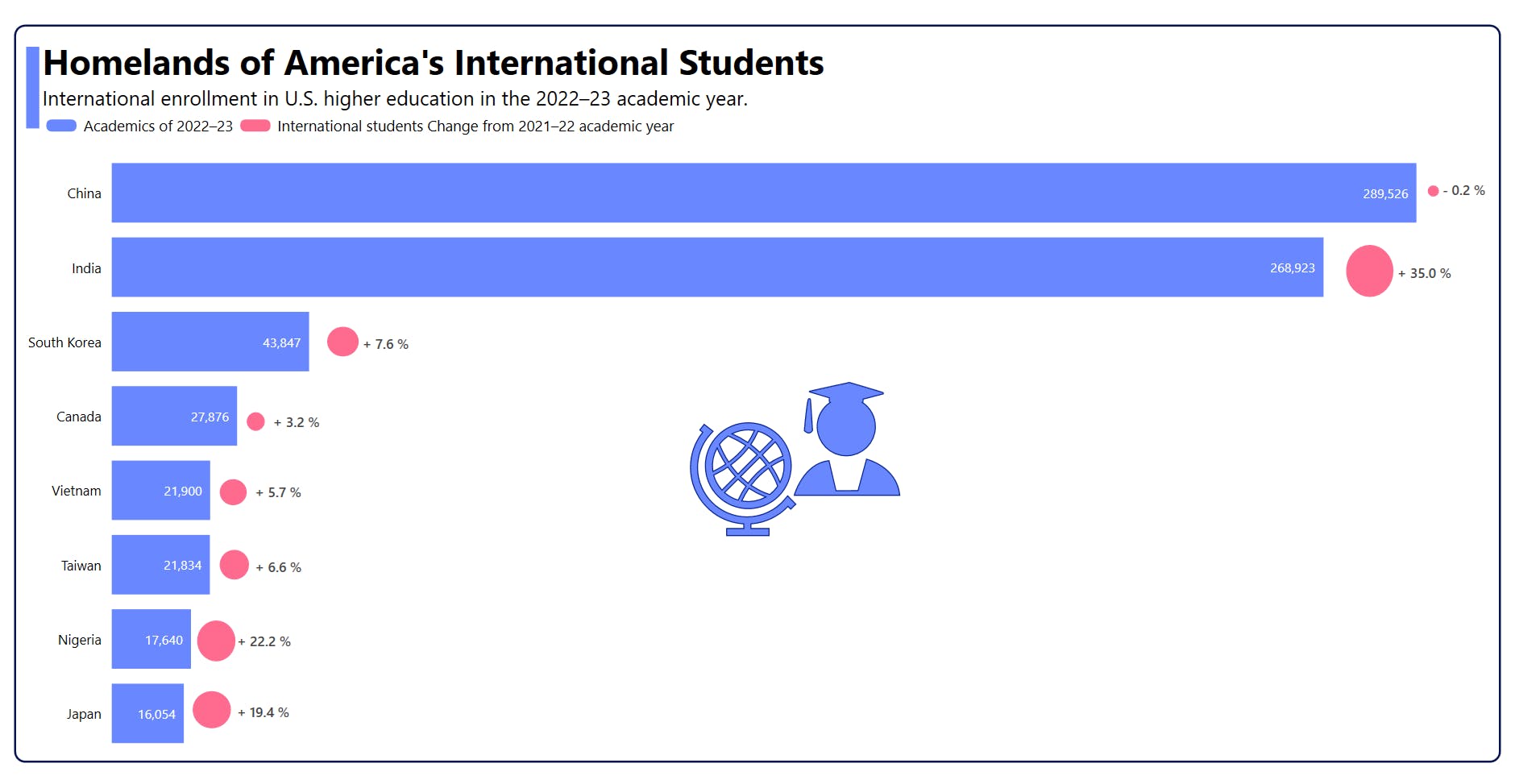
Visualization of the Homelands of America’s International Students with the WPF Bar Chart
GitHub reference
For more details, refer to the complete project on [GitHub](github.com/SyncfusionExamples/Creating-a-WP.. "WPF Bar Chart to Visualize the Homelands of Americas International Students GitHub demo").
Conclusion
Thank you for reading! In this blog, we discussed how to visualize the U.S. international student enrollment data in the 2022–2023 school year compared to 2021–2022 using the [WPF Bar Chart](syncfusion.com/wpf-controls/charts/wpf-bar-.. "WPF Bar Chart"). We encourage you to follow the steps provided in this blog and share your feedback in the comments section below.
If you need assistance, please do not hesitate to contact us through our [support forum](syncfusion.com/forums "Syncfusion Support Forum"), [support portal](support.syncfusion.com "Syncfusion Support Portal"), or [feedback portal](syncfusion.com/feedback "Syncfusion Feedback Portal"). We are always ready and willing to help you!
Related blogs
- [Chart of the Week: Creating a WPF Stacked Bar Chart to Visualize the Social Media Use of US Teens in 2023](syncfusion.com/blogs/post/wpf-stacked-bar-c.. "Blog: Chart of the Week: Creating a WPF Stacked Bar Chart to Visualize the Social Media Use of US Teens in 2023")
- [What’s New in 2023 Volume 4: WinUI and WPF](syncfusion.com/blogs/post/2023-vol-4-winui-.. "Blog: What’s New in 2023 Volume 4: WinUI and WPF")
- [What’s New in WPF Diagram: 2023 Volume 4](syncfusion.com/blogs/post/whats-new-wpf-dia.. "Blog: What’s New in WPF Diagram: 2023 Volume 4")
- [Chart of the Week: Creating a WPF 3D Pie Chart to Display the Biggest Cash Crops in the U.S](syncfusion.com/blogs/post/wpf-3d-pie-chart-.. "Blog: Chart of the Week: Creating a WPF 3D Pie Chart to Display the Biggest Cash Crops in the U.S")