#chart
Read more stories on Hashnode
Articles with this tag
TL;DR: Let’s visualize wage trends in the Texas oil and gas extraction industry over the last fifteen years using the Syncfusion .NET MAUI Line Chart....
This blog provides show notes for our May 2 webinar, “Visualize Customer Survey Reports Using Our React 3D Circular Charts Control.” The webinar was...
TL;DR: Let’s collect and showcase the world vehicle production data across major countries using the Syncfusion WPF 100% Stacked Area Chart. We will...
TL;DR: Let’s visualize the most popular Wikipedia articles of 2023 using Syncfusion .NET MAUI Sunburst Chart. Learn to gather, bind, and visualize...
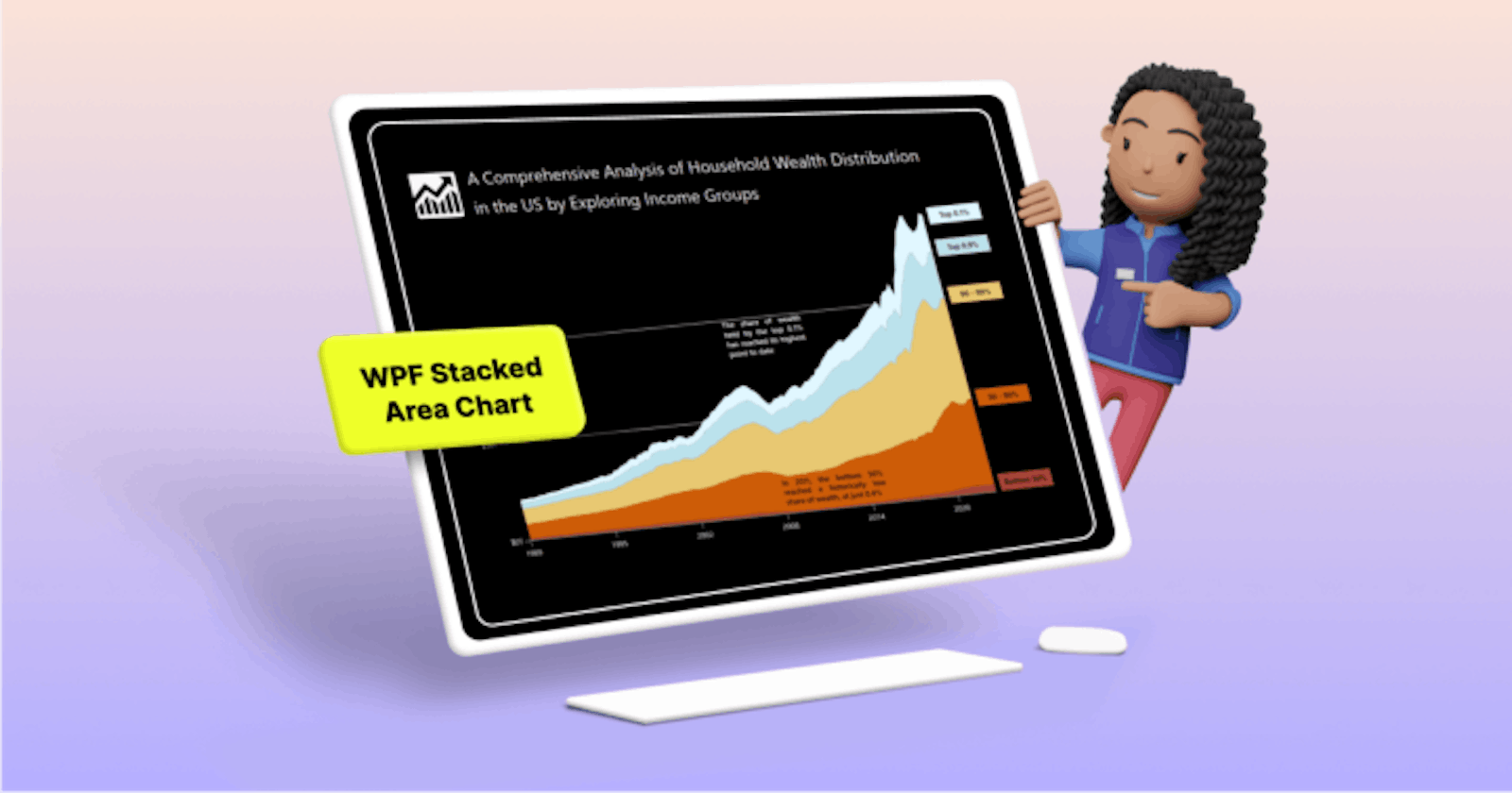
TL;DR: Learn to visualize wealth distribution in the U.S. from 1990 to 2023 using Syncfusion WPF Stacked Area Chart. Explore a step-by-step guide on...


![Visualize Customer Survey Reports Using React 3D Circular Charts [Webinar Show Notes]](https://cdn.hashnode.com/res/hashnode/imageupload/v1715088519087/612eeaef-8598-4266-a79d-0cb385155412.png?w=1600&h=840&fit=crop&crop=entropy&auto=compress,format&format=webp)
![Visualize Customer Survey Reports Using React 3D Circular Charts [Webinar Show Notes]](https://cdn.hashnode.com/res/hashnode/imageupload/v1715087918366/a663ee14-a468-4221-8afc-23799a607a2d.png?w=1600&h=840&fit=crop&crop=entropy&auto=compress,format&format=webp)